FloatingActionButton in Flutter

A floating action button is a circular icon button that hovers over the content and clicks a performed event. Floating action buttons are most commonly used in mobile applications.


Constructor : 

Syntax:

 FloatingActionButton({Key key, 

Widget child, 

String tooltip, 

Color foregroundColor, 

Color backgroundColor, 

Color focusColor, 

Color hoverColor, 

Color splashColor, 

Object heroTag: const _DefaultHeroTag(), 

double elevation, 

double focusElevation, 

double hoverElevation, 

double highlightElevation, 

double disabledElevation, 

@required VoidCallback onPressed, 

MouseCursor mouseCursor, 

bool mini: false, 

ShapeBorder shape, 

Clip clipBehavior: Clip.none, 

FocusNode focusNode, 

bool autofocus: false, 

MaterialTapTargetSize materialTapTargetSize, 

 bool isExtended: false})

Properties
  • autofocus: This property is used to check initial focus or not it returns boolean values 
  •  backgroundcolor: The background color of the button.
  • Child :widget to be displayed
  • clipbehaviour: this property clip enum as the object to decide the content
  • disabledElevation: this property button on the z-coordinate when the button is disabled.
  • elevation: z-coordinate on which the button will be placed
  • focusnode: it provides additional focus  on the button
  • forgoundcolor: the set color of the foreground
  •  hovercolor: the set has color on the button
  • Mini: control the size of the button 
  • Impressed: splashes color of floatingActionButton
Here is the step by step Implementation process:
Step 1:Create a new project in the Flutter project or you can use an already created Flutter project. 


Step 2: When loading a Flutter project at time first call the main method that will call our application.


Step 3: Below code write in Homescreen.dart in lib folder 
 import 'package:flutter/material.dart';

void main() {
runApp(HomeScreen());
}

class HomeScreen extends StatelessWidget {
@override
Widget build(BuildContext context) {
return MaterialApp(
theme: ThemeData(
primarySwatch: Colors.green, // Set the app's primary theme color
),
debugShowCheckedModeBanner: false,
home: ExtendedFAB(),
);
}
}

class ExtendedFAB extends StatefulWidget {
@override
_ExtendedFABState createState() => _ExtendedFABState();
}

class _ExtendedFABState extends State<ExtendedFAB> {
bool showOptions = false;

void toggleOptions() {
setState(() {
showOptions =
!showOptions; // Toggling the visibility of additional options
});
}

@override
Widget build(BuildContext context) {
return Scaffold(
appBar: AppBar(
title: Text('Fab Example'),
),
body: Center(
child: Text(
'Candidroot solutions',
style: TextStyle(fontSize: 24),
),
),
floatingActionButton: Column(
mainAxisAlignment: MainAxisAlignment.end,
children: [
FloatingActionButton.extended(
onPressed: () {
toggleOptions(); // When the main FAB is pressed, toggleOptions is called
},
label: Text(' FAB'),
icon: Icon(Icons.add),
backgroundColor: Colors.amber,
),
SizedBox(height: 16.0),
Visibility(
visible:
showOptions, // Show the options only if showOptions is true
child: Column(
children: [
FloatingActionButton(
onPressed: () {
// Add your action for Option 1
},
tooltip: 'Option 1',
child: Icon(Icons.multiline_chart),
),
SizedBox(height: 16.0),
FloatingActionButton(
onPressed: () {
// Add your action for Option 2
},
tooltip: 'Option 2',
child: Icon(Icons.settings),
),
],
),
),
],
),
);
}
}
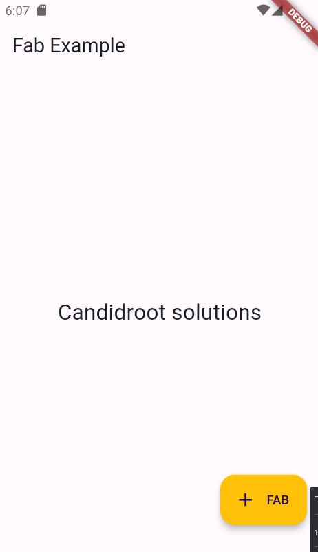
Step 4: Output of above example


Happy coding!


365Bloggy May 27, 2024
Share this post
Tags
SUBSCRIBE THIS FORM


Archive