DropDownButton Widget  -  Flutter

A material design button is called a DropDownButton. We can choose one distinct value from a range of values using the DropDownButton widget. The user can choose one value from a variety of options. The value that is currently selected is displayed by default. We can even add an icon for a down arrow to the list. The user can choose the desired option from a list of options that appears when they click the DropDownButton of Mobile Application.

 In this article, you will learn how to create your DropDownButton widget in Flutter. So let’s take DropDownButton​ example of the DropDownButton  in Flutter of Mobile application.

Video example of DropDownButton widget mentioned below


Syntax
  DropdownButton( 
  {    
Key key, @required List<DropdownMenuItem<T>> items, DropdownButtonBuilder selectedItemBuilder, T value, Widget hint, Widget disabledHint, @required ValueChanged<T> onChanged, VoidCallback onTap, int elevation: 8, TextStyle style, Widget underline, Widget icon, Color iconDisabledColor, Color iconEnabledColor, double iconSize: 24.0, bool isDense: false, bool isExpanded: false, double itemHeight: kMinInteractiveDimension, Color focusColor, FocusNode focusNode, bool autofocus: false, Color dropdownColor } )

Step-by-Step Implementation
Step 1: Create a New Project in Android Studio (File >new flutter project). 


Step 2: Adding material package 

Import method the runApp method in the main function call first while run the application.

 import 'package:flutter/material.dart';

 void main() {

     runApp(RunMyApp());

 }

Step 3: Creating a stateless widget 

We can create a stateless widget that contains MaterialApp widget,AppBar,etc.

 class RunMyApp extends StatelessWidget {

     const RunMyApp({super.key});  

    @override

    Widget build(BuildContext context) {

    return MaterialApp(home);

     }

 }

Step 4: Final code of DropDownButton .
 import 'package:flutter/cupertino.dart';
import 'package:flutter/material.dart';

void main() {
runApp(const MyApp());
}

class MyApp extends StatelessWidget {
const MyApp({Key? key}) : super(key: key);
@override
Widget build(BuildContext context) {
return MaterialApp(
title: 'Flutter DropDownButton',
theme: ThemeData(
primarySwatch: Colors.green,
),
home: const MyHomePage(),
debugShowCheckedModeBanner: false,
);
}
}

class MyHomePage extends StatefulWidget {
const MyHomePage({Key? key}) : super(key: key);

@override
_MyHomePageState createState() => _MyHomePageState();
}

class _MyHomePageState extends State<MyHomePage> {

// Initial Selected Value
String dropdownvalue = 'Item 1';

// List of items in our dropdown menu
var items = [
'Item 1',
'Item 2',
'Item 3',
'Item 4',
'Item 5',
];
@override
Widget build(BuildContext context) {
return Scaffold(
appBar: AppBar(
title: const Text("CandidRoot Solutions"),
),
body: Center(
child: Column(
mainAxisAlignment: MainAxisAlignment.center,
children: [
DropdownButton(

// Initial Value
value: dropdownvalue,

// Down Arrow Icon
icon: const Icon(Icons.keyboard_arrow_down),

// Array list of items
items: items.map((String items) {
return DropdownMenuItem(
value: items,
child: Text(items),
);
}).toList(),
onChanged: (String? newValue) {
setState(() {
dropdownvalue = newValue!;
});
},
),
],
),
),
);
}
}


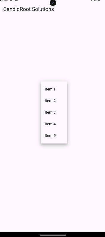
Output of above example


Happy coding!

365Bloggy July 2, 2024
Share this post
Tags
SUBSCRIBE THIS FORM


Archive